6 Equitable Office Interior Design Tips to Improve DIBE.
Date
10 January 2022
Read length
4 min
Diversity, Inclusion, Belonging and Equity (DIBE) encourages a more holistic strategy for organisations.
Rather than blindly hiring a more diverse workforce, a DIBE strategy will consider both visible and invisible elements of diversity. It puts the focus on creating a workplace where everybody feels a sense of inclusion, belonging, and safety, and recognises that because everybody is unique, they may require varying means of support to level the playing field. It all makes great business sense too.
A survey by The Manifest website showed 70% of job seekers want to work for a company that demonstrates a commitment to diversity and inclusion. GreatPlaceToWork found that more diverse and inclusive workforces have 5.4 x the employee retention of their competitors. McKinsey reported that companies with greater gender and ethnic diversity outperform those with limited gender and diversity by 25% and 36% respectively.
In spite of this, DIBE is only placed in 5% of workplaces’ top 3 HR priorities (CIPD). So, what can be done in the physical workplace to support the move toward becoming more diverse and inclusive? The answer lies in equity and adjusting office design to encourage greater inclusivity, belonging and in turn, diversity.
Here, we share six requirements of DIBE-focused office interior design:
1. Wellbeing: Modern wellbeing rooms are a marked improvement on their barely-used predecessor – the welfare room. Wellbeing rooms provide a moment of contemplation. That might be to help colleagues recharge after an emotionally-charged experience, decompress after a challenging commute or simply to grab five minutes to prepare mentally for an important meeting.
These spaces should be discretely located and ideally close to an entrance, so colleagues don’t have to walk through the office to access the space. They should feature neutral and calming colours, natural light where possible, plants and natural imagery. Importantly, they should also be tech-free.
2. Acoustics: The everyday sounds associated with a typical workplace can make it hard for some employees to focus. Those prone to distraction, such as people with ADHD or autism can find it impossible to work. At the other end of the acoustic range, an office space can be too quiet. Without masking low-level, ambient background noise every conversation or phone call intrudes. Effective workplace acoustic design provides a variety of settings to support diverse auditory activities and locates them appropriately, relative to one another, to ensure acoustic separation between them.
3. Multi-faith rooms: We’ve heard horror stories of employees praying in stairwells or store cupboards or having to drive to pray in appropriate spaces, especially during holy festivals. Provision of a dedicated multi-faith room demonstrates an organisation is faith-friendly – which is shown to increase employee morale by 62%, employee retention by 38% and employee loyalty by 37%.
A gold-standard multi-faith room caters for all religions – with storage for iconography and scriptures, a dividing screen so different religions/genders can pray next to each other simultaneously, storage space for rugs/ pillows/ shoes, directional signage, a wudu for washing and the ability to adjust the lighting level.
4. Light: Studies have shown that the brightness, type and colour temperature of light can have dramatic effects on the quality of experience for both neurodivergent and neurotypical users. Access to daylight increases physical wellbeing and improves mental and physical health; this can have a direct corelation on worker productivity. The latest WELL building standards specify that office users should work within 4.5 metres of a window.
5. No fuss: Creating different settings for users to choose the right level of sensory stimulation in their surroundings is a key aspect of inclusive design. For some users cluttered, noisy or even smelly environments can be distracting, while for others a lack of stimulation can prevent concentration.
Neurodivergent users can benefit from hyper-focused environments with minimal visual clutter and the ability to personalise the lighting and level of background noise.
6. Wayfinding: So all users can find their way around a building easily, create clear circulation paths. Repeated wayfinding signage and colour accents can help to achieve this, as well as providing visual interest and memorability. Use artwork and graphics as focal cues to help users orientate themselves sparingly and keep signage simple and consistent. Include Braille in your wayfinding to help the visually-impaired.
With greater equity, particularly for those in minority groups, they will feel valued and included, so diverse talent is attracted to your organisation and will stay longer. Should clients, customers or partners visit your workplace – they’ll get the same benefits of your equitable office interior design too.
It really is time for all employers to create more equitable work environments.
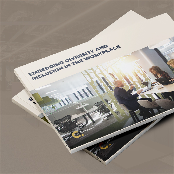
To find out more about the role of DIBE in modern office interior design, download our latest whitepaper here.
See how we could help with your new office interior design or office design and build project here
Get in touch
We love nothing better than talking all things workplace and design – got a question, potential project or just need some guidance?
Drop us a note…


